RIT Beehive Data
Hives and Sensors
Here's an overview of the beehives at RIT and the various sensors that have been installed in them.
RIT Hives
RIT has up to four beehives, with the exact number varying by season as colonies come and go. They're arranged roughly in a square:
- Hive A (northwest hive)
- Hive B (southwest hive)
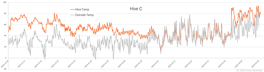
- Hive C (northeast hive)
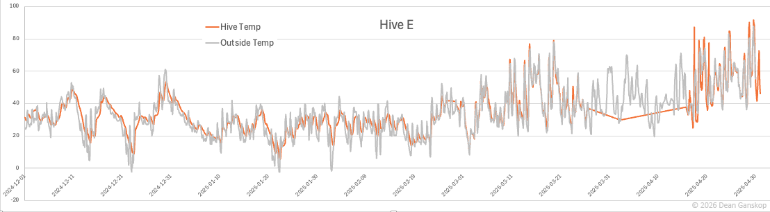
- Hive E (southeast hive)
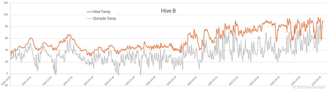
Currently, as of late winter 2026, Hives A, B, and C are active.
Each hive has a BroodMinder temperature and humidity sensor. Additionally, BroodMinder "BeeDar" sensors, which track bees as they're flying into and out of the hive, have periodically been installed on some of the RIT hives.
During the 2024-2025 academic year, each hive also had a "DIY monitor", developed at RIT. Each DIY monitor had several sensors.
For more information about the RIT hives or about beekeeping in general, check out the RIT Beekeeping Club. They typically meet a couple times each month during the school year.
BroodMinder Sensors
The following visualizations of BroodMinder sensor data from the RIT hives are provided by BroodMinder:
Hive A (NW)
https://map.beecounted.org/hive/summary/fb05
Hive B (SW)
https://map.beecounted.org/hive/summary/727f
Hive C (NE)
https://map.beecounted.org/hive/summary/d260
Ganskop Hives
In addition to the RIT hives, there are also several BroodMinder sensors installed in hives owned by Professor Dean Ganskop.
Throughout the winter of 2024-2025, there were six temperature/humidity sensors installed in the Ganskop "middle" hive. The hive consisted of three medium boxes, so there were three sensors down the center of the hive - one above each box - and three down the side of the hive, just inside the hive wall. This arrangement of sensors allowed for monitoring the difference in temperature between the cluster of bees and the surrounding air.
As of late winter 2026, the temperature/humidity sensors are spread across three hives, and there are also BeeDar sensors and a weight scale.
BroodMinder Data
You can download all BroodMinder data for the RIT and Ganskop hives, beginning from when we started collecting in October 2024 through today.
The BroodMinder data is organized per hive, with dated files for each device. Each file has a header row that describes the content for each field in the file. Here's the list of device types:
- device IDs beginning with
56: - BroodMinder Temperature and Humidity Sensor (placed within a hive)
- device IDs beginning with
57: - BroodMinder Weight Scale (placed under a hive)
- device IDs beginning with
63: - BroodMinder BeeDar (radar that monitors the hive entrance)
RIT DIY Sensors
During the 2024-2025 academic year, we collected data (including temperature, humidity, and acoustics) from the RIT hives using homemade monitors. These monitors were designed and built by Computer Engineering Technology undergraduate student John Schulz. A second iteration of the monitors is currently underway to improve performance and convenience.
As you peruse the data from our homemade monitors, you'll notice various gaps and anomalies in the data. Throughout this deployment and monitoring process, we've run into several problems, such as interference from Bluetooth and WiFi, broken wires, faulty sensors, and poor battery charge/life. We hope v2 will correct these problems.
/api/monitor
This will return all readings for all monitors, sorted in
reverse chronological order:
https://beehive.gccis.rit.edu/api/monitor
You can specify an individual hive by including the hive letter
in the path, e.g.:
https://beehive.gccis.rit.edu/api/monitor/B
You can limit the number of readings per hive with the
limit query string parameter, e.g.:
https://beehive.gccis.rit.edu/api/monitor?limit=20
https://beehive.gccis.rit.edu/api/monitor/B?limit=20
The monitor endpoint will return a series of sensor
readings, formatted like below:
          monitor id|timestamp|hive temp|hive humidity|hive acoustics|external temp|external pressure|battery life
          c14dc33a38ef5474|2024-12-10 10:05:03-05:00|6|70|15|9|995|26
          c14dc33a38ef5474|2024-12-10 10:04:02-05:00|6|70|17|9|995|30
          c14dc33a38ef5474|2024-12-10 10:03:02-05:00|6|70|16|9|995|34
          c14dc33a38ef5474|2024-12-10 10:02:01-05:00|6|70|14|9|995|30
          c14dc33a38ef5474|2024-12-10 10:01:01-05:00|6|70|13|9|995|25
          c14dc33a38ef5474|2024-12-10 10:00:00-05:00|6|70|13|9|995|38
          c14dc33a38ef5474|2024-12-10 09:58:59-05:00|6|70|13|9|995|31
          c14dc33a38ef5474|2024-12-10 09:57:58-05:00|6|70|15|9|995|26
          c14dc33a38ef5474|2024-12-10 09:56:58-05:00|6|70|13|9|995|26
          c14dc33a38ef5474|2024-12-10 09:55:57-05:00|6|70|13|9|995|34
The data points returned from the monitor endpoint
are as follows:
-
monitor id: unique identifier for each hive monitor:- Hive B (SW): 2b9680f6b54ccc45
- Hive C (NE): 3d0d8721b29bbed2
- Hive E (SE): c14dc33a38ef5474
-
timestamp: ISO timestamp in the local timezone -
hive temp: hive temperature reading in degrees Celsius -
hive humidity: hive relative humidity reading percentage -
hive acoustics: relative measurement of hive loudness -
external temp: outside temperature reading in degrees Celsius -
pressure: outside barometric pressure reading in millibars -
battery life: approximate battery life percentage
Data Insights
Many various insights have been gleaned from reviewing the data from hive sensors. Here's a recounting of some of them...
Cluster vs. Hive vs. Outside Temperature
Over winter, honeybees form a cluster to maintain warmth. This ball of bees slowly moves through the hive during the winter, in a generally upward direction, consuming their stored honey. The bees' heating is quite efficient: rather than heating the entire hive, they only need to maintain the heat of their cluster in order to survive.
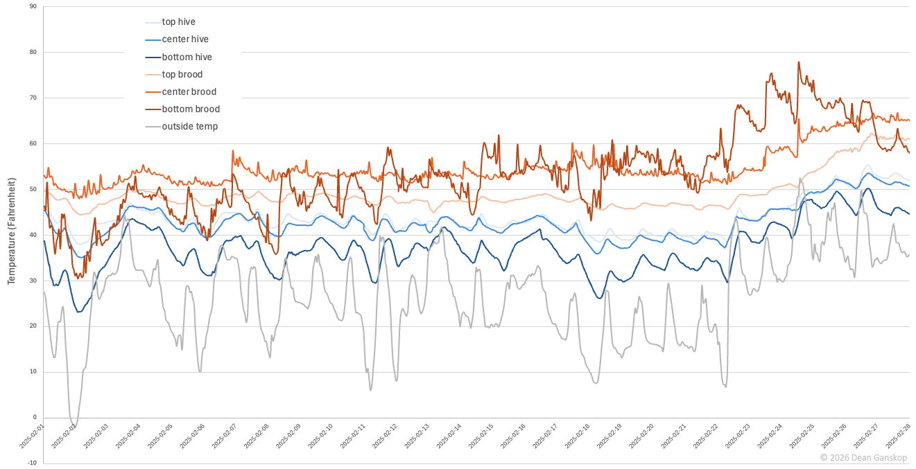
The chart below shows temperature data for a hive during February 2025. This hive consisted of three medium boxes (as opposed to the typical two deep boxes). There were three sensors down the center of the hive (labeled "brood" in the chart, represented by the orange lines) - one above each box - and three down the side of the hive (labeled "hive", the blue lines), just inside the hive wall. This arrangement of sensors allowed for monitoring the difference in temperature between the cluster of bees and the surrounding air. The temperature outside the hive is represented by the gray line.
Clearly, there is a large temperature difference between the cluster's temperature and the air temperature inside the hive. The cluster was nearest the center and bottom brood sensors, which report a temperature sometimes 30 degrees Fahrenheit warmer than the air temperature elsewhere in the hive. During the night of February 2, when the outside temperature dropped to below 0°F, the air temperature in the bottom of the hive was almost 10°F below freezing, and yet the cluster - represented by the bright orange line - maintained a temperature of nearly 50°F.
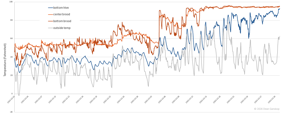
Brood Rearing
This chart represents the same hive as the previous chart, but the date range here extends an additional month, through the end of March. (Additionally, a few of the data series have been removed for clarity). On approximately March 15, the temperature fluctuations of the cluster cease and the bees begin thermoregulating at almost exactly 93°F (the orange lines), which is a strong indication of brood rearing, as the optimal temperature for larvae to develop is 92°-98°F.
Swarming
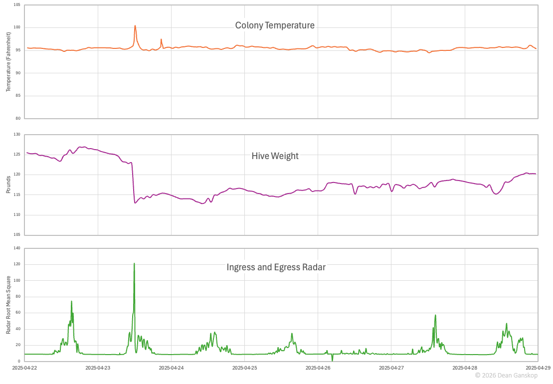
When a colony swarms, about half of the bees, including the queen, leave the hive. Included among these bees are many workers who have been occupied with cleaning, nursing, attending the queen, and building comb, and thus have not yet flown. In preparation for swarming (about 20 minutes before departure), these bees warm up their flight muscles, and that results in a brief spike in temperature, as shown in the first chart below, around noon on April 23.
The second chart shows how much weight the hive lost when the bees swarmed. Each worker weighs about 0.1 grams (0.0035oz), so the nearly 10-pound drop on April 23 represents something like 45,000 bees leaving the hive.
Finally, the third chart confirms the swarm event, by showing a spike in the relative daily comings and goings from the hive. The y-axis shows the radar root mean square, that is, the average magnitude of the radar signals. Most days include bees leaving and reentering the hive, so the great spike on the 23rd from bees only leaving the hive represents a huge number of bees departing.
Healthy vs. Dead Overwintering Hives
While an overwintering cluster mostly heats itself, there is some residual heat that elevates the temperature of the air inside the hive over that of the outside air. This first chart shows a healthy distance between the temperatures in the hive and outside.
In this chart, the temperature inside the hive exactly mirrors that outside the hive, indicating that this colony was dead before Dec 1. (Note that there's bad data from Mar 26 through Apr 15.)
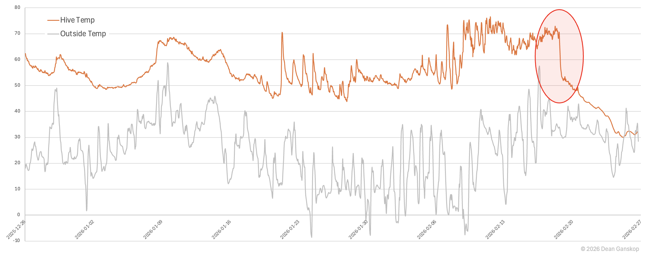
Finally, this chart shows a healthy hive until Feb 25, when the lines converge. The colony died after a brief warm-up outside and then a plunge in the temperature. Likely, the colony broke cluster while it was warm and then when it formed a cluster as the temperature dropped, it did so away from its remaining food stores and ended up starving to death. The lines in the chart diverge after the hive was repopulated with a new colony on Apr 13.
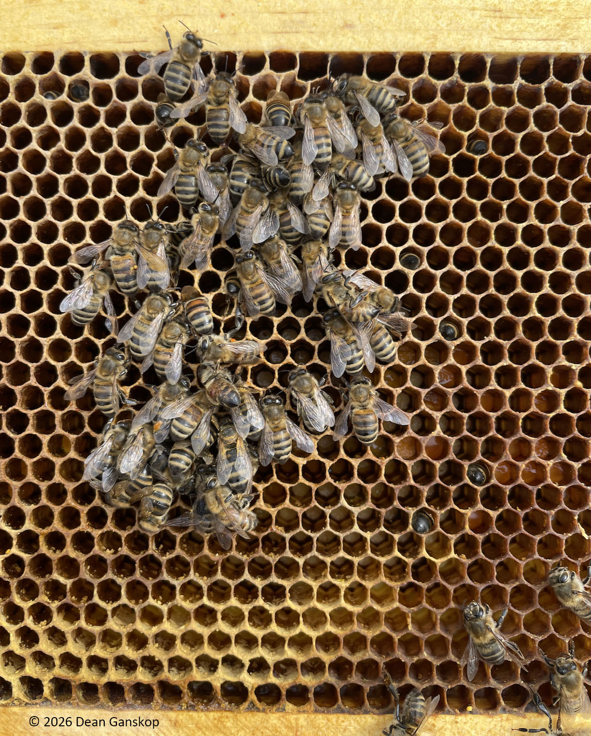
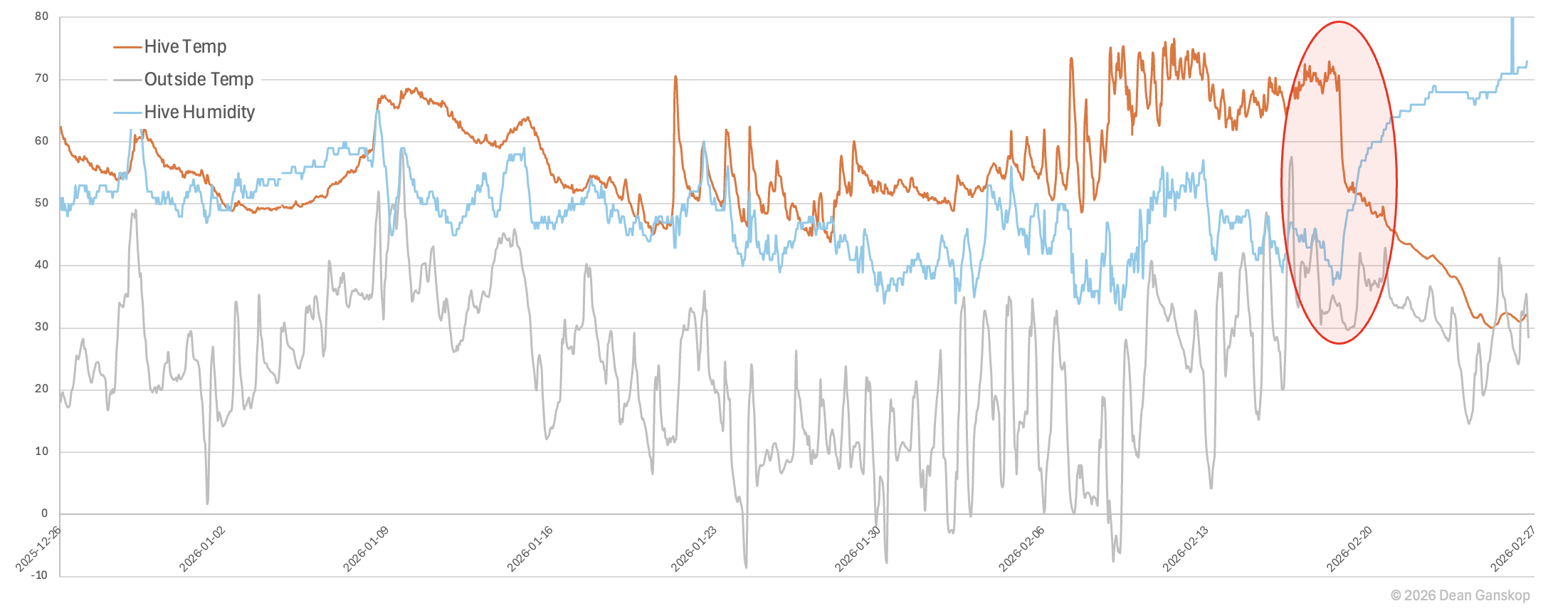
Winter Death from Varroa
After a few months of the hive sensors pointing to healthy hives, on Feb 18 the temperature sensor suddenly showed a precipitous drop. Unfortunately, a hive inspection a few days later corroborated the fact that the colony had died.
The bees in the hive looked healthy, without obvious signs of disease or dysentery. The photos look like what one would expect to see in a live colony... except for that fact that when the photos were taken, none of the bees were moving. There was still plenty of honey in the hive, and in fact it looked like the cluster was located right in the middle of the honey stores.
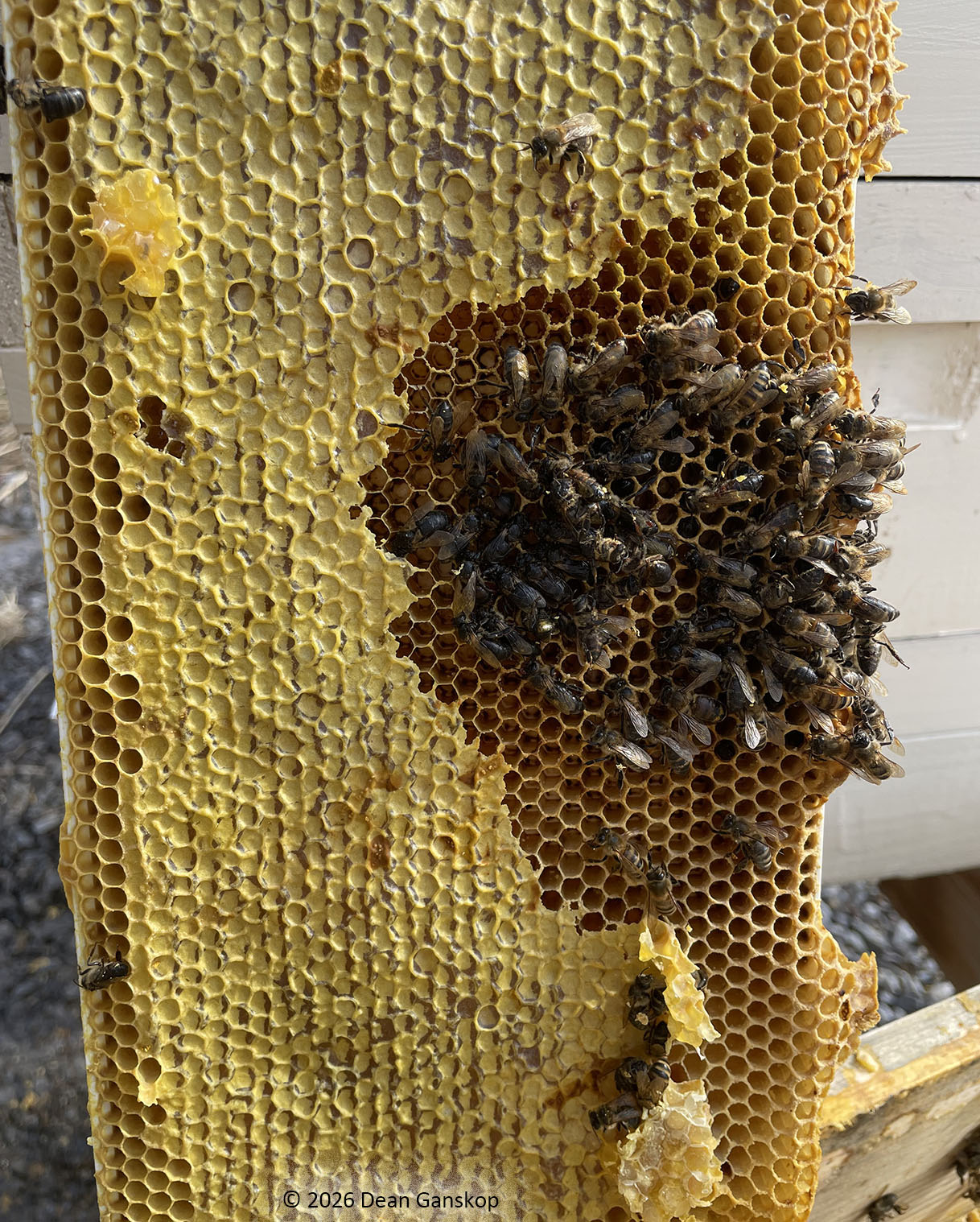
There was some mold on the top bars of the top hive, but I think it's likely that the mold significantly increased after the colony died. This is the same chart as before, except a series has been added for the hive humidity. It shows that the relative humidity increased substantially after the colony died, which is logical, since, as long as the dew point is approximately constant, humidity increases as temperature decreases.
Closer inspection of the photos, however, reveals what is the likely culprit in the colony's death...

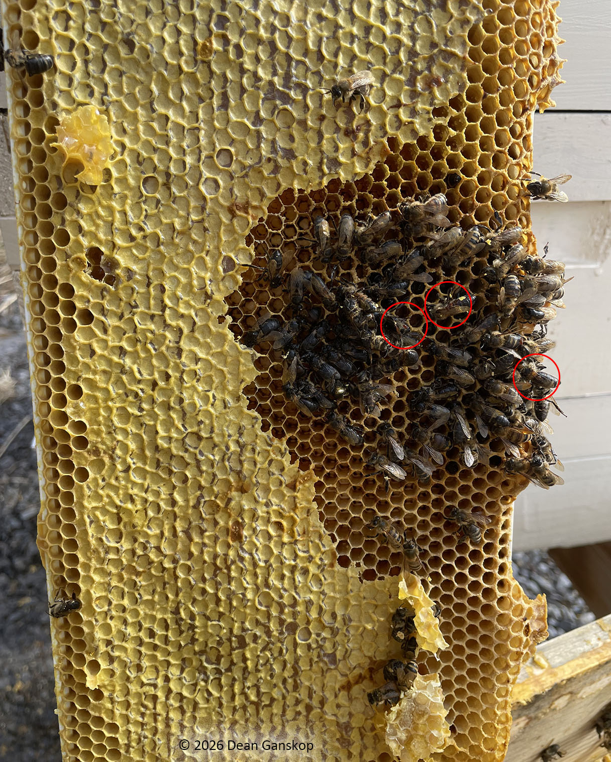
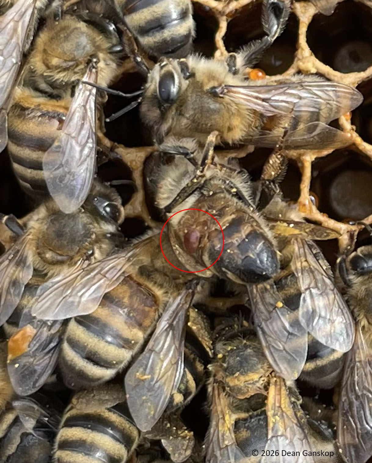
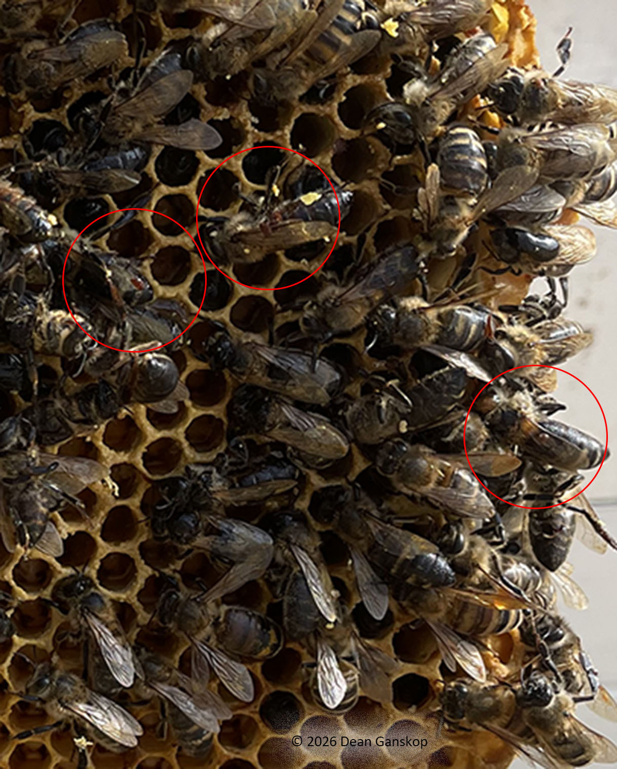
This hive had been treated with a couple oxalic acid vaporizations 5 days apart, but mite counts were not taken. It seems likely that the varroa mite population had been knocked down enough to allow the bees to survive most of the winter, but they were sufficiently weakened that when the outside temperature dropped to around freezing for a few days in the middle of February, the bees were not able to generate enough heat and died of hypothermia.